
Management and recognition are not the same job
A grid or dashboard can expose many controls at once. That is useful when the task is bulk cleanup. It can be more interface than necessary when the task is simply: which of these similar tabs contains the page I need?
TabShow keeps the interaction adjacent to browsing. The side panel is a list, the main window is the preview, and leaving the panel reverses the tentative switch.
Enough context without dashboard weight
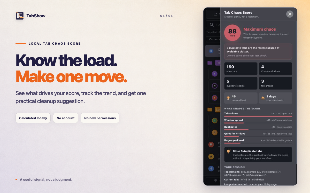
The TabShow panel includes search, window scope, sorting, Chrome groups, pinned state, audio or muted state, sleeping tabs, duplicate markers, and a local Chaos Score. Context supports recognition rather than becoming a separate workspace.
- Current, recent, domain, and group sorting.
- Visible groups and group colors.
- Close individual tabs from the list.
- Keyboard selection and open controls.
Pick the interface cost that matches the task
If you repeatedly perform bulk selection, moving, or cleanup, a full manager may deserve the screen. If most visits end when you recognize one page, TabShow's narrow loop removes steps.
The best alternative is not the one with the longest feature list. It is the one whose default interaction matches your next action.
Which job are you hiring the tool for?
You want a broad overview with management-heavy controls and bulk operations across many tabs and windows.
You want a side panel that stays beside the page, surfaces useful context, and previews a live candidate without making every search a dashboard visit.